Are you looking for free UI tips for your user interface design? This blog article will help you get off to a good start!Your UI design serves as your right-hand man in amplifying your website functionality. But for your first-time web visitors, it is a maze that is difficult to navigate.A good UI design moves your target audience to hit that call-to-action button. While a bad UI design prompts web users to walk away from your website with frustration. Time is of utmost importance to web users. You don’t want them to leave with a terrible impression of your website.Not everyone is knowledgeable of the UI design system for designing an interface. But we are here to walk you through the best UI design tips and processes for the effective functionality of your website. Apply these design tips and watch your user interaction and retention propel to new heights!
Best UI Tips to Follow for a Consistent and Intuitive Web Design
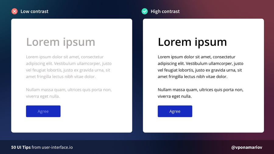
1. Check your color contrast
Contrast influences the scannability and visual hierarchy of your web page. Bad color contrast can irritate web users, which leads to low web traffic. The important guideline to remember is interactive elements need to meet a color contrast ratio of 4.5:1.You may visit Web Content Accessibility Guidelines (WCAG) 2.1 for recommendations on the best UI tips in terms of contrast level for your web page.
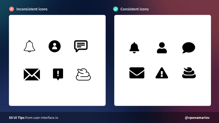
2. Be consistent with your icons
Another best UI tips is optimizing your icons. Icons can cause usability problems if you design them without consideration. To achieve harmony, maintain the same stylistic rules throughout your icons. Icons work great when they share the same style, theme, grid, width, and color palette.
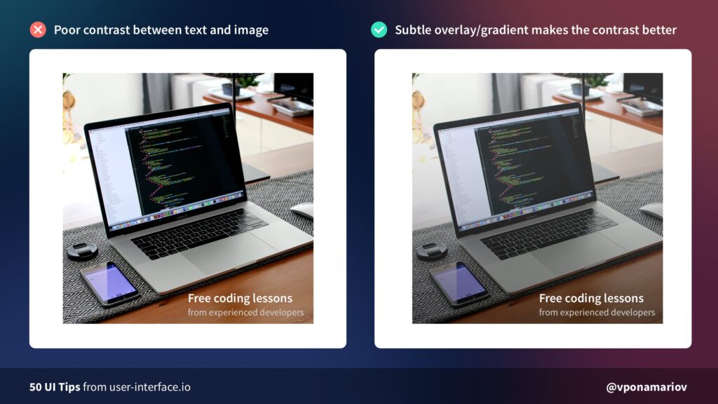
3. Make use of subtle overlay
Placing text over an image demands a sense of balance. You need to find visual harmony between these elements. For better contrast, add overlay or gradient on your images. This will make your text legible and readable to your users.
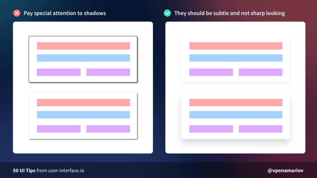
4. Tone down your shadows
Although easy to implement, shadows can work against you if done incorrectly. Another UI tip is to make it look softer and more natural. You can achieve this by lowering opacity (10–30%) and setting a higher level of blur (16px-40px).
5. Don’t justify text
Justified texts are among bad typography habits that scream poor UI design. It is difficult to read for long form content. Also, it creates unnecessary negative space due to extra word spacing.
6. Enhance clickable areas
When the clickable area is too small, buttons will not respond until you click on a specific area. Improve this by making the button size larger and closer to its sibling input element.

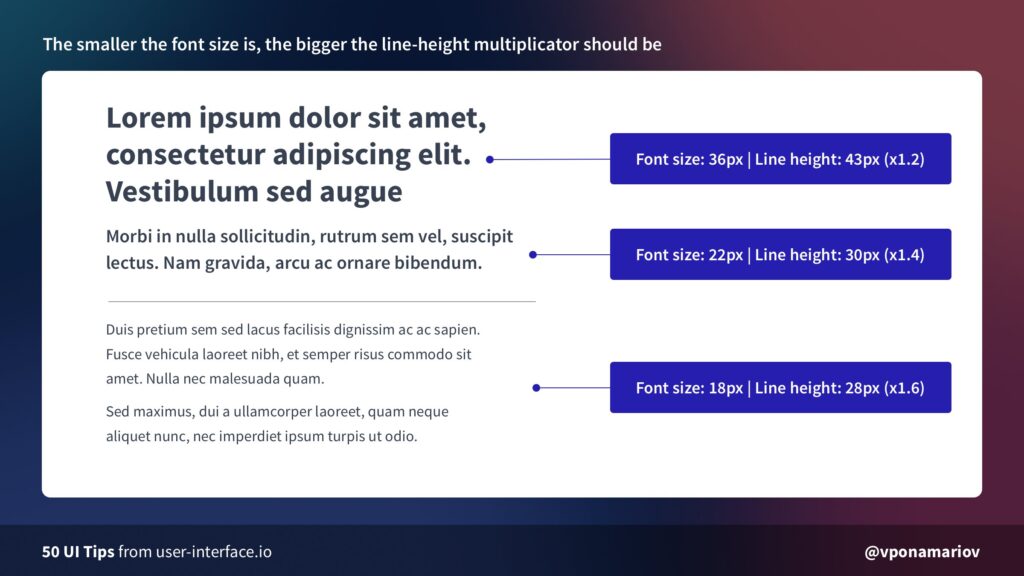
7. Set a reasonable line-height multiplicator
Another UI tip is working on the line-height multiplicator of your website. Line-height multiplicator defines the readable line spacing for your text. If your font size is big, it’s reasonable to make your line height multiplicator small. If your font size is small, increase your line height multiplicator for better readability.
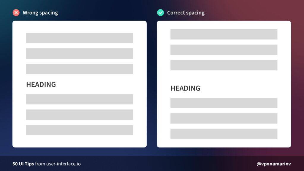
8. Pay attention to heading margins
Another UI tip is working on the line-height multiplicator of your website. Line-height multiplicator defines the readable line spacing for your text. If your font size is big, it’s reasonable to make your line height multiplicator small. If your font size is small, increase your line height multiplicator for better readability.

Best UI Tips to Boost Your Conversion Rate
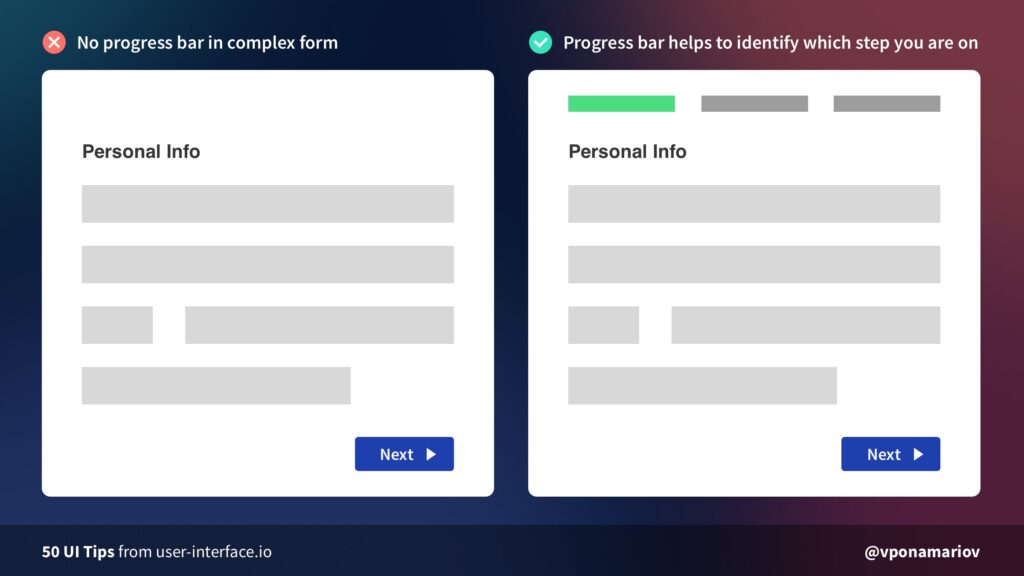
9. Show progress bars
Managing user expectations is a daunting task. Users need progress indicators for any action that consumes their valuable time. For tasks such as completing a form, a progress bar comes in handy.A progress bar guides users on which step they are on and how many steps are left. Showing a progress bar will likely increase the conversion of completing a form.
10. Avoid the Z-pattern layout
Our eyes get tired by moving diagonally back down to the bottom and across again. This is this UI tips article explains why Z-pattern designs result in increasing cognitive load. For a better user experience, stick to good alignment: left to right, top to bottom.

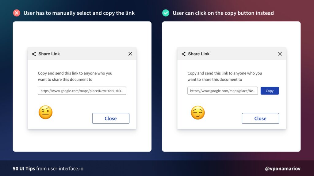
11. Improve copying to clipboard experience
Without the copy button, users do the extra work of copying the link to the clipboard. This is not a friendly-user approach for your first-time website visitors. To cut this manual work, add a copy-on-click button to your interface.
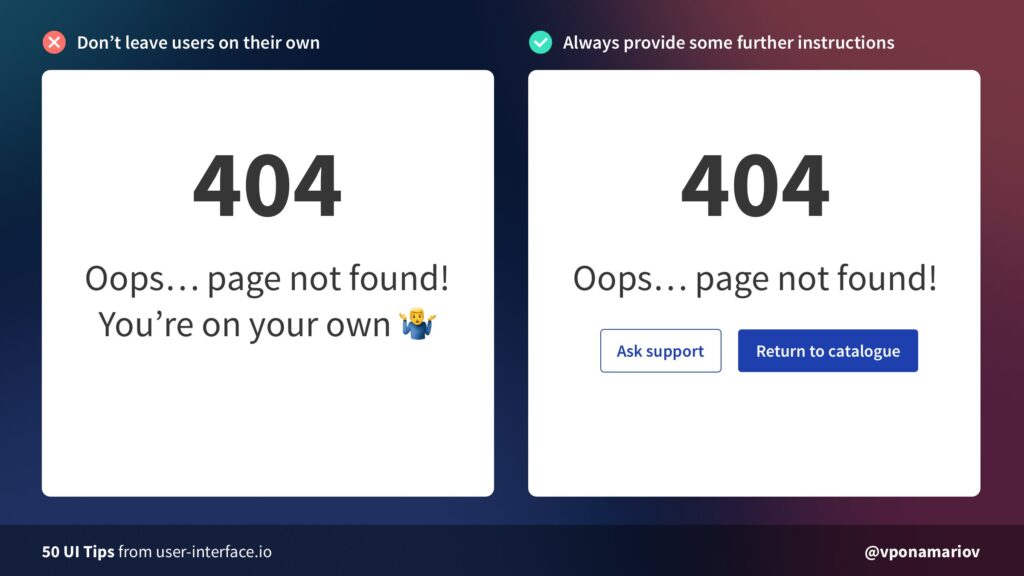
12. Provide further instructions for 404 Error Pages
“Oops, page not found!” will not help users to take automatic actions. Don’t leave them on their own. Tell users what to do next, or at least direct them to appropriate actions to deal with the status code.
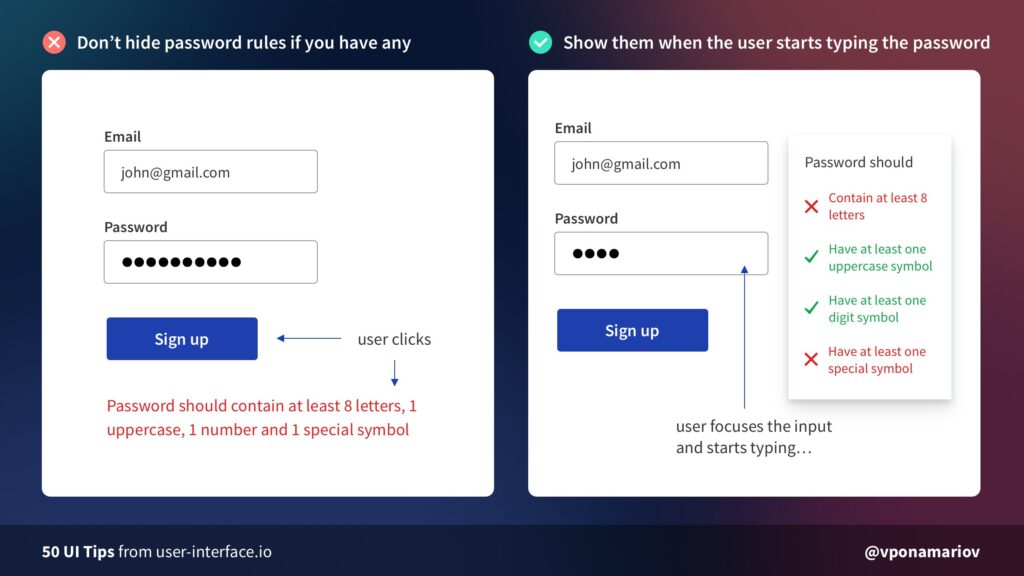
13. Don’t hide password rules
Password creation always requires complex requirements. Too often, users abandon completing a form because they can’t create a strong password. To make users stay on password fields, avoid hiding password rules.Pro-tip: If you have 1-2 password rules, display them somewhere near the input. For complex rules, highlight satisfied rules while the user types his password.
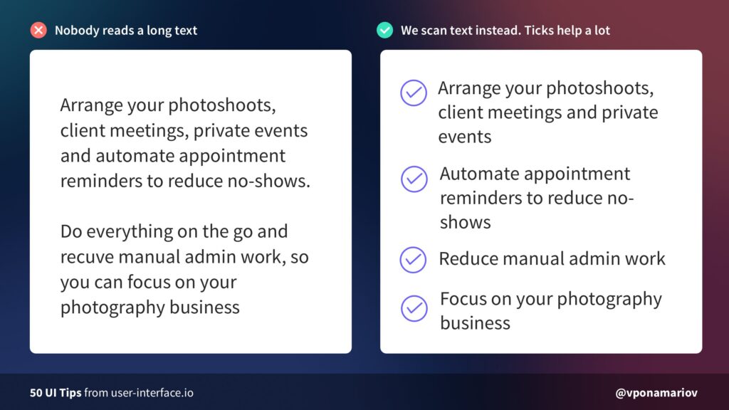
14. Use tick icons
Web users are not a fan of long texts, especially on landing pages. Most of them scroll through only 50-60% of an article page on the web. That said, you should use tick icons to make your page more scannable.
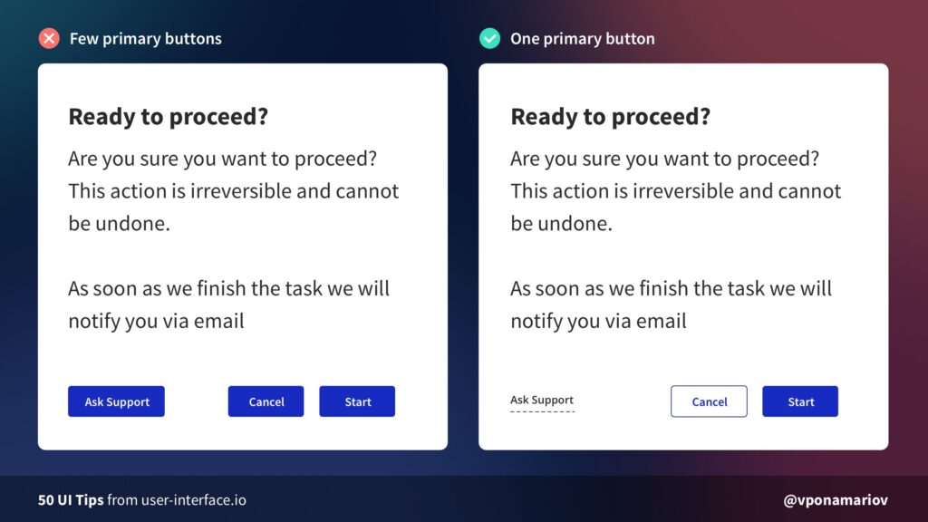
15. Minimize primary buttons
Web users are not a fan of long texts, especially on landing pages. Most of them scroll through only 50-60% of an article page on the web. That said, you should use tick icons to make your page more scannable.
Outsource Your UI Development Needs to KDCI
Are you still learning the ropes of designing user interfaces? You can save tons of time and money by outsourcing it to a reliable outsourcing company. Stop creating UI design on a whim. Work with seasoned UI/UX designers for attractive and easy-to-understand user interfaces.Our group of experts keeps tabs on the latest UI trends in the realm of visual design. You can have peace of mind while we maximize your website for effective functionality. Start your outsourcing journey today by clicking the button below!Contact Us


